Why this matters
- Friction: Too many steps and forms at kickoff.
- Confidence: People want guidance on risk and goals.
- Consistency: Auto-funding helps build the habit.
Case study
We built a hands-off investing experience inside the banking app: automated funding rules, clear risk profiles, and goal-based tracking to reduce the friction of getting started if you're a first-time investor.
For users who don't know where to get started, it can be a daunting task to learn the terminology, risks, and popular investing strategies - we sought to eliminate the confusion by allowing clients to fund their investment account and let it grow automatically.
Investing is intimidating and time-consuming. We needed a low-effort, high-clarity flow that helps clients start and stay the course.
Prove that clients can onboard faster, fund consistently, and understand performance at a glance. Competitor experiences like Wealthsimple continue to offer experiences that are pulling clients and funds away from the Big 5.
Reduce setup friction and initial drop-offs.
Drive recurring contributions with rules.
Improve comprehension of risk/reward.
We kicked off with a cross-functional workshop before splitting into workstreams to design, build, and validate the experience.
Aligned with Strategy, Design, and Dev/Tech on goals, distractors, user personas, and initial ideas — then prioritized together before splitting into individual workstreams.
Moved from wireframes to low-fidelity prototypes, then several rounds of high-fidelity iteration ahead of testing.
Ran unmoderated sessions in Maze. Clients told us investing terminology was hard to follow as first-timers, that visualizations and projections were essential to understanding growth over time, and that they were hesitant to trust AI-driven suggestions without knowing where the data came from and how current it was.
Iterated on the findings, then packaged the work into an interactive prototype and showcase video — which was later greenlit as a full sprint to take through to delivery.
The entire experience revolves around plain-English language that educates users without feeling overwhelming, and intuitive moments to adjust investments as easily as possible.
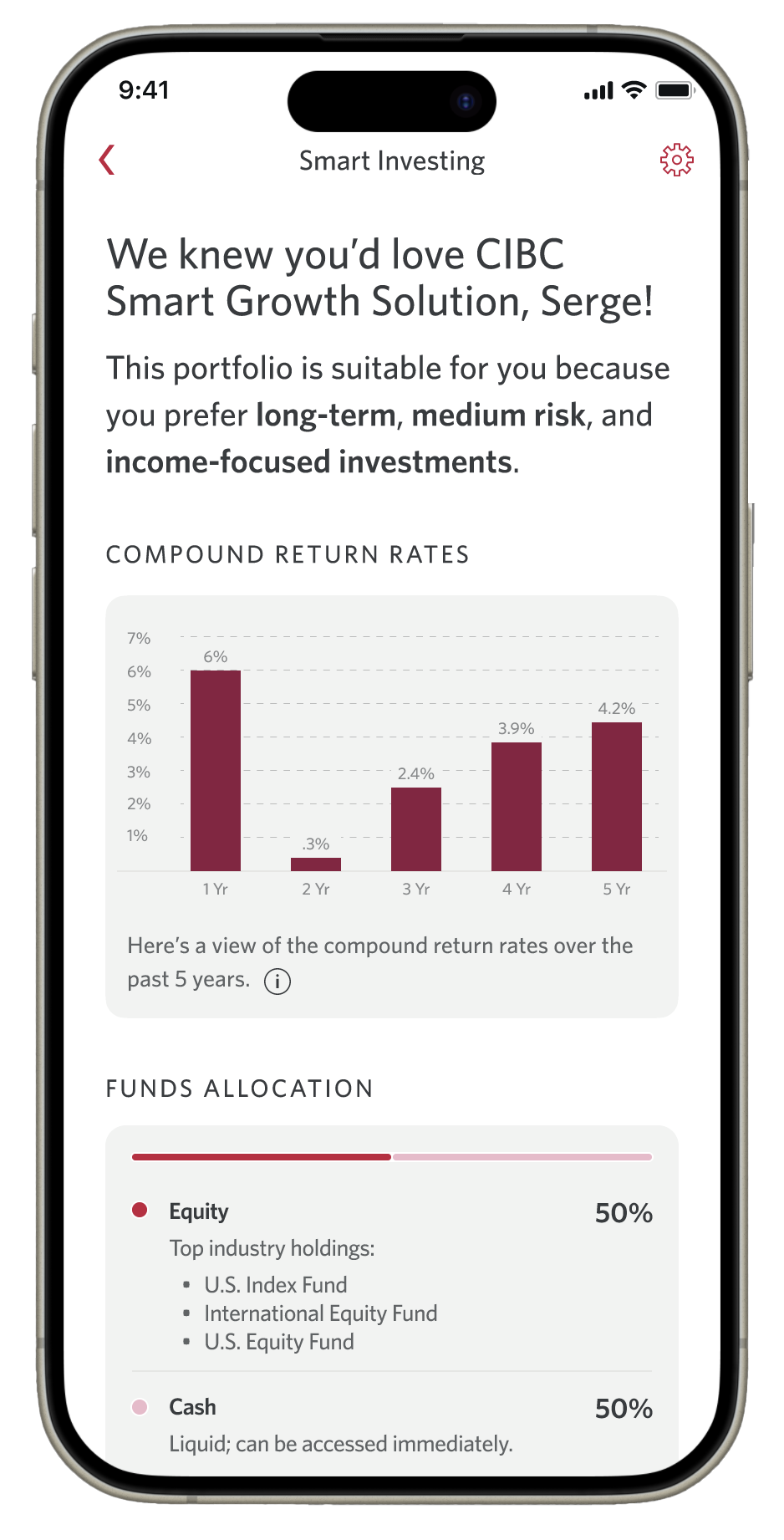
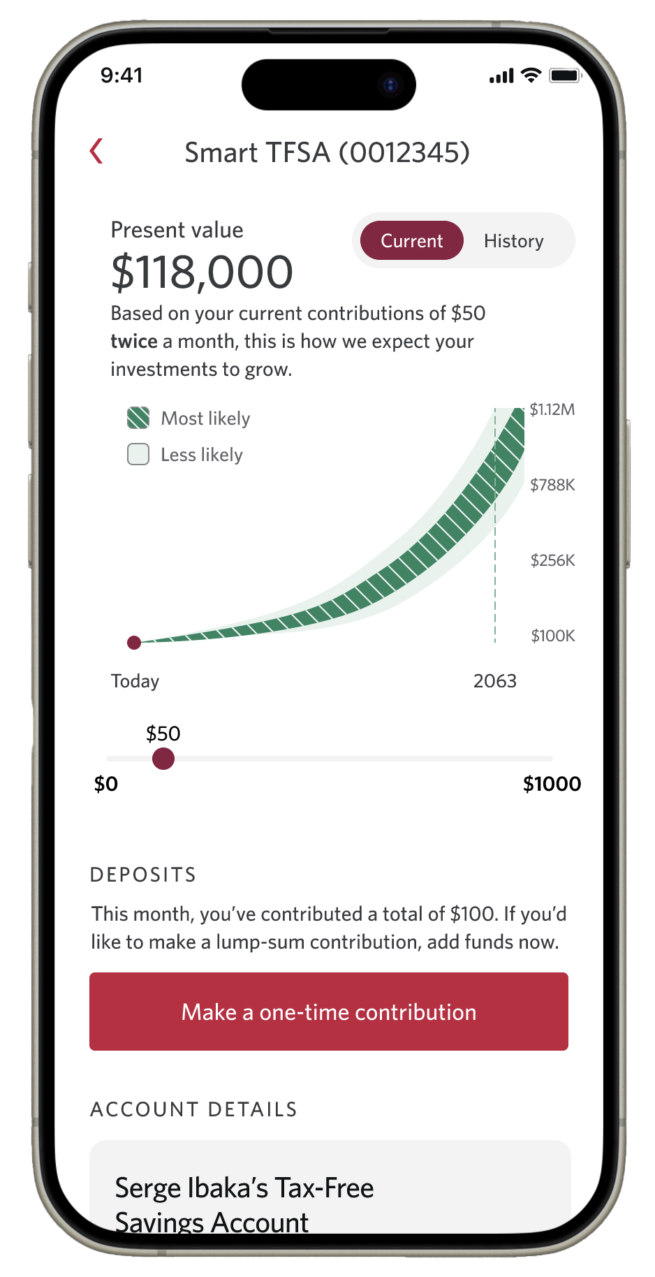
Plain-language trade-offs with progressive disclosure.
Round-ups, pay-day boosts, scheduled top-ups.
Progress to goal, milestones, and projections.
The design and content trade-offs that shaped the experience.
Generic onboarding questionnaires don't serve the true financial goals of clients - understanding their investing experience, knowledge of terminology, and risk appetite through plain language prompts led to improved success.
The key to quicker and more confident client decisions was being able to compare different investing options at a glance.
A combination of graphs, contribution breakdowns, and future projections were most effective at allowing clients with little to no investing experience understand the impact these decisions would make on their long-term finances.
Reducing friction to fund account as much as possible benefitted both clients (utility of investing platform immediately available) and business by having more successfully funded investing products.
Hands-off tools that can be adjusted when necessary, and prompts to view and adjust activity as needed form the core of a good and useful client experience.
What we measured through user testing questionnaires in moderated sessions.